


Building charts and graphs is part of most people’s jobs — it’s one of the best ways to visualize data in a clear, easily digestible manner. (Check out this guide for making better charts to learn more.)
However, it’s no surprise that some people get a little bit intimidated by the prospect of poking around in Microsoft Excel. I actually adore Excel, but I work in Marketing Operations, so it’s pretty much a requirement.

That’s why I thought I’d share a helpful video tutorial as well as some step-by-step instructions for anyone out there who cringes at the thought of organizing a spreadsheet full of data into a chart that actually, you know, means something. Here are the simple steps you need to build a chart or graph in Excel. And if you’re short on time, check out the video tutorial below.
Keep in mind there are many different versions of Excel, so what you see in the video above might not always match up exactly with what you’ll see in your version. In the instructions below, I used Excel 2017 version 16.9 for Max OS X.
We encourage you to follow along with the written instructions and demo data below (or download them as PDFs using the links below) so you can follow along. Most of the buttons and functions you’ll see and read are very similar across all versions of Excel.
Download Demo Data | Download Instructions (Mac) | Download Instructions (PC)

How to Make a Graph in Excel
- Enter your data into Excel.
- Choose one of nine graph and chart options to make.
- Highlight your data and ‘Insert’ your desired graph.
- Switch the data on each axis, if necessary.
- Adjust your data’s layout and colors.
- Change the size of your chart’s legend and axis labels.
- Change the Y axis measurement options, if desired.
- Reorder your data, if desired.
- Title your graph.
1. Enter your data into Excel.
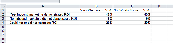
First, you need to input your data into Excel. You might have exported the data from elsewhere, like a piece of marketing software or a survey tool. Or maybe you’re inputting it manually.
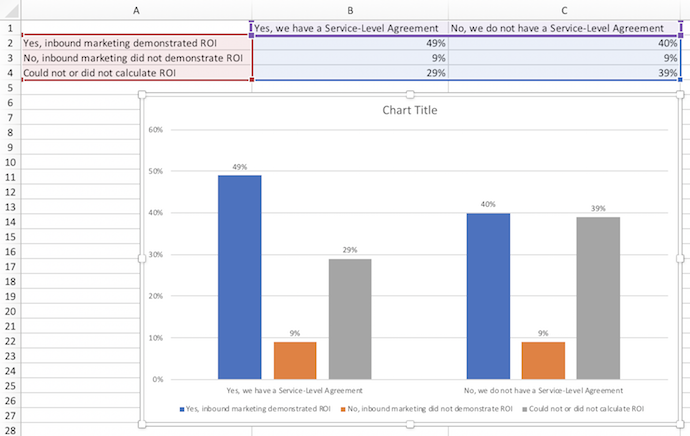
In the example below, in Column A, I have a list of responses to the question, “Did inbound marketing demonstrate ROI?”, and in Columns B,C, and D, I have the responses to the question, “Does your company have a formal sales-marketing agreement?” For example, Column C, Row 2 illustrates that 49% of people who have an SLA (service level agreement) also say that inbound marketing demonstrated ROI.
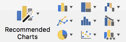
2. Choose one of nine graph and chart options to create.
In Excel, you have plenty of choices for charts and graphs to create. This includes column (or bar) graphs, line graphs, pie graphs, scatter plot, and more. See how Excel identifies each one in the top navigation bar, as depicted below:
(For help figuring out which type of chart/graph is best for visualizing your data, check out our free ebook, How to Use Data Visualization to Win Over Your Audience.)
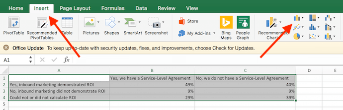
3. Highlight your data and ‘Insert’ your desired graph.
The data I’m working with will look best in a bar graph, so let’s make that one. To make a bar graph, highlight the data and include the titles of the X and Y axis. Then, go to the ‘Insert‘ tab, and in the charts section, click the column icon. Choose the graph you wish from the dropdown window that appears.
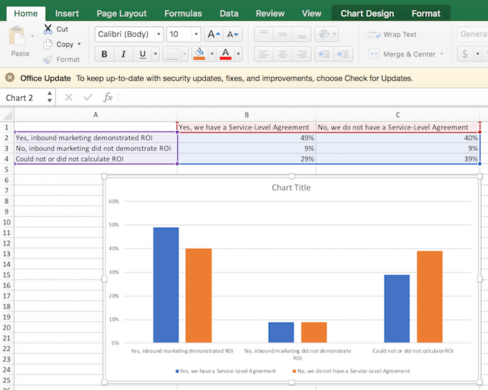
In this example, I picked the first 2-dimensional column option — just because I prefer the flat bar graphic over the 3-D look. See the resulting bar graph below.
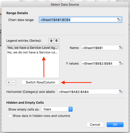
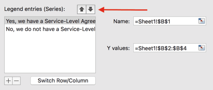
4. Switch the data on each axis, if necessary.
If you want to switch what appears on the X and Y axis, right-click on the bar graph, click ‘Select Data,’ and click ‘Switch Row/Column.’ This will rearrange which axes carry which pieces of data in the list shown below. When you’re finished, click ‘OK’ at the bottom.
The resulting graph would look like this:
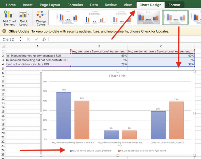
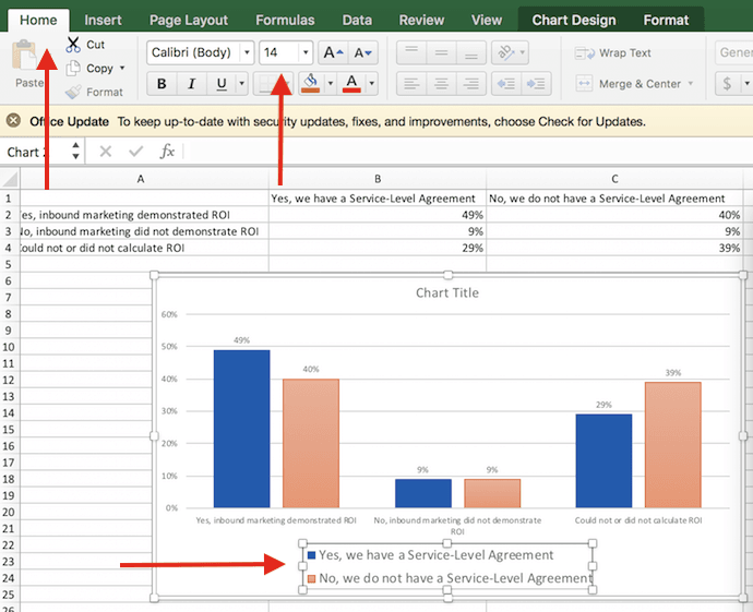
5. Adjust your data’s layout and colors.
To change the layout of the labeling and legend, click on the bar graph, then click the ‘Chart Design‘ tab. Here, you can choose which layout you prefer for the chart title, axis titles, and legend. In my example (shown below), I clicked on the option that displayed softer bar colors and legends below the chart.
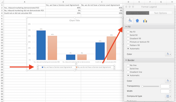
To further format the legend, click on it to reveal the ‘Format Legend’ sidebar, as shown below. Here, you can change the fill color of the legend, which will in turn change the color of the columns themselves. To format other parts of your chart, click on them individually to reveal a corresponding Format window.
6. Change the size of your chart’s legend and axis labels.
When you first make a graph in Excel, the size of your axis and legend labels might be a bit small, depending on the type of graph or chart you choose (bar, pie, line, etc.). Once you’ve created your chart, you’ll want to beef up those labels so they’re legible.
To increase the size of your graph’s labels, click on them individually and, instead of revealing a new Format window, click back into the ‘Home‘ tab in the top navigation bar of Excel. Then, use the font type and size dropdown fields to expand or shrink your chart’s legend and axis labels to your liking.
7. Change the Y axis measurement options, if desired.
To change the type of measurement shown on the Y axis, click on the Y axis percentages in your chart to reveal the ‘Format Axis‘ window. Here, you can decide if you want to display units located on the Axis Options tab, or if you want to change whether the Y axis shows percentages to 2 decimal places or to 0 decimal places.
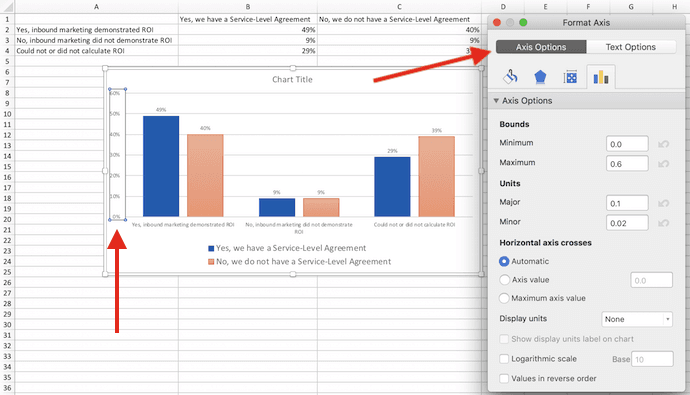
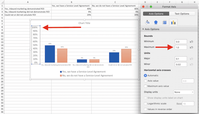
Because my graph automatically set the Y axis’s maximum percentage to 60%, I might want to change it manually to 100% to represent my data on a more universal scale. To do so, I can select the ‘Maximum‘ option — two fields down under ‘Bounds‘ in the Format Axis window — and change the value from 0.6 to 1.
The resulting graph would be changed to look like the one below (I increased the font size of the Y axis via the ‘Home’ tab, so you can see the difference):
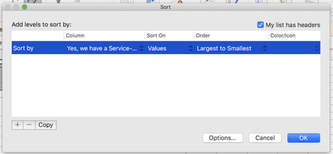
8. Reorder your data, if desired.
To sort the data so the respondents’ answers appear in reverse order, right-click on your graph and click ‘Select Data’ to reveal the same options window you called up in Step 3 above. This time, click the up and down arrows, as shown below, to reverse the order of your data on the chart.
If you have more than two lines of data to adjust, you can also rearrange them in ascending or descending order. To do this, highlight all of your data in the cells above your chart, click ‘Data,’ and select ‘Sort,‘ as shown below. You can choose to sort based on smallest to largest or largest to smallest, depending on your preference.
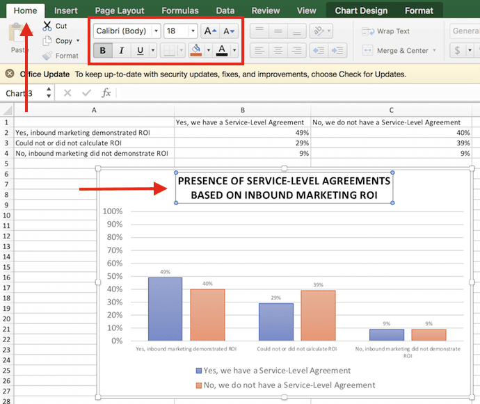
9. Title your graph.
Now comes the fun and easy part: naming your graph. By now, you might have already figured out how to do this. Here’s a simple clarifier.
Right after making your chart, the title that appears will likely be “Chart Title,” or something similar depending on the version of Excel you’re using. To change this label, click on “Chart Title” to reveal a typing cursor. You can then freely customize your chart’s title.
When you have a title you like, click ‘Home‘ on the top navigation bar, and use the font formatting options to give your title the emphasis it deserves. See these options and my final graph below:
Pretty easy, right? Check out some additional resources below for additional help using Excel and visualizing your data in smart ways.
Additional Resources for Using Excel and Visualizing Data:
Want even more Excel tips? Check out this post on how to add a second axis to an Excel chart.


Deje su comentario